When starting a podcast, there’s a lot to consider. You have to figure out what your podcast topic is going to be, come up with a name, decide whether you’ll do an interview or topic-based show, and create a podcast logo.
Well, these things among many others.
Don’t worry – we’ve got you covered on all fronts with our Complete Guide on How to Podcast!
But in this post we’re going to focus on just one aspect of your podcast: your podcast logo.
If you’re not a design expert, then you’re probably wondering where to go to get the best logo for your podcast. Typically anything design-related is a big investment, and since this will be the face of your show – the first thing people see when they’ll scrolling their favorite podcast app to find new podcasts – it’s important.
Let’s start with covering what a podcast logo should include, and then we’ll dive into the two options you have:
- How to make your own podcast logo
- Where to get the best podcast logo designed for you
What Should a Podcast Logo Include?
A podcast logo is important. It’s typically a potential listeners first impression of your podcast and brand. What your podcast logo communicates – or doesn’t communicate – to people could mean the difference between them deciding to tune in or continuing to scroll for other options.
There are really 3 critical things your podcast logo should include:
- Your podcast title
- An overall easy-to-digest visual that stands out
- All cover art requirements from Apple Podcasts
In essence, a potential listener should be able to look at your podcast logo one time and quickly and easily understand exactly what your podcast is about and what it can offer them.
Your podcast logo should not overwhelm them, confuse them, or make them want to run the other way!
Your Podcast Title
Make your podcast title BIG and CLEAR on your cover art. This means you need to choose a font that’s easy to read, and try to avoid using more than 2 different fonts at most. Maximize the space available, because there isn’t much of it!
It’s always a good idea to test out your podcast logo at different sizes so you can get a feel for what it will look like to someone scrolling their favorite podcast app when they come across your show.
Ask yourself these questions to confirm your podcast title within your logo meets the basic criteria of CLEAR:
- Is it easy to read your podcast title at a variety of different sizes?
- Does your podcast title easily communicate to your potential listener whether your show is for them?
- Is it bold and dark enough so that the title isn’t getting faded out by other colors or the background of your logo?
These are just a few of the questions you need to ask yourself to make sure your podcast title is legible and makes sense immediately when someone sees your logo.
Another quick tip on naming your podcast – not related to artwork per-say – is to confirm your title is specific. Use keywords and language that YOUR avatar will understand and resonate with.
Easy-to-Digest Visual That Stands Out
Whether it’s a color combination, a plain background, or an icon or visual representation of your podcast topic, your logo should provide an overall easy-to-digest visual for your potential listeners that stands out in a sea of other podcast logos.
This means any text should POP and be clearly separated from background images, and there shouldn’t be too many competing symbols or colors.
You want your podcast logo to be loud and stand out, but you don’t want it to be confusing. The worst thing you can do is overcrowd your logo, making it look “busy” or potentially confusing.
So if your podcast is – let’s say, about podcasting – then having one podcasting icon alongside your podcast title is probably going to quickly max out the space you have available.
And make sure you consider what you actually need to include on the logo itself. Remember, in addition to your logo, you have your podcast description space, a place to put your tagline, and a link to your website available to listeners on all podcasting apps, so people will easily be able to learn more about your podcast without having to see the information right on your podcast artwork.
Make it clear and easy for someone to see your logo and, without getting overwhelmed, know exactly what it’s all about.
Meets All Requirements
If you’re sure to meet all cover art requirements from Apple Podcasts, then chances are you’ll be safe on any other platform you choose to submit your podcast to.
Simply read through the Apple Podcasts artwork requirements and make sure you’re checking all the boxes (or that whoever is designing your podcast artwork for you has this information.)
Generally speaking it’s most important that your cover art is square, at least 1400×1400 pixels (no larger than 3000×3000), 72 dpi, a JPEG or PNG, and in the RGB colorspace. But be sure to check the link above for the most up-to-date requirements before starting to design your logo.
If your podcast logo does not meet the current Apple Podcasts requirements, then your RSS feed will be denied and you will not be able to publish your podcast on the major directories. You can use an RSS Feed Validator like Cast Feed Validator to confirm you have the green light prior to submitting to Apple Podcasts.
Quick Tips As You Brainstorm Your Podcast Logo
Ask for Feedback Throughout the Process
Whether you decide to create your own logo or have someone else design it for you, it’s important to ask for feedback so you have other perspectives and input before finalizing.
Since you’ve likely been thinking about this and imagining what your logo will look like for a long time, there might be certain aspects of it that an outside perspective could add valuable advice on.
While you can update your logo at any time, it’s smart to consider how others view your artwork, too.
So as you start coming up with ideas for what your logo might look like, ask friends, colleagues, and post to your social following for input!
- What are their first impressions?
- Does it clearly communicate what your podcast will be about?
- Is it visually appealing, does it stand out?
This is also a great way to start getting the word out about your new podcast prior to launching!
Should Your Logo Include YOU On It?
This is one question we get asked a lot: “Should I include an image of myself on my logo?”
The short answer is, no.
What it comes down to is this: unless you’re Oprah, people likely aren’t going to recognize you or know who you are.
And while some might argue that a face can help build a faster connection and know/like/trust, your voice is going to do that via your show regardless of whether your face is on the logo or not.
If you look to the TOP podcasts, none of them have an image of a person on the cover, and that’s enough for me to conclude that it’s not best practice.
Does this mean you can’t have your image on the cover?
Of course not!
Remember, this is YOUR show, so if you really want your image on the cover, go for it!
How to Create Your Own Podcast Logo
Now that you know everything your podcast logo should include and a couple of top tips as you head into the design phase, let’s talk about how you can design your own podcast logo.
Thanks to the many podcast logo maker programs available, it turns out you don’t have to be a professional designer to still create something awesome!
Creating your own podcast logo is a great way to get started without investing a lot of time or money. While your podcast logo is very important, it shouldn’t hold you back from launching your podcast. You can always choose to change your podcast logo later.
One podcast logo maker you can check out is called DesignEvo. I haven’t tried this program out myself, but the reviews are great. In just 3 steps you can have your podcast artwork designed and ready to go.
All you have to do is choose a template, add your text and icon, and hit save!
Beware that with a podcast logo maker you’re likely to run across a logo or two that look similar. So if you’re going for a unique logo, it might be better to just start from scratch.
Make Your Podcast Logo From Scratch
Sometimes using a template can result in a not-so-unique design, so if you want a logo that’s really unique and you’re ready to get creative, then go for it!
You can always update your logo at a later date and time, so just because you choose one now doesn’t mean you need to keep it forever.
A couple of design programs that I’ve used before and that I know will work great if you have podcast logo designs in mind are:
These programs offer a lot more customization since they don’t have pre-filled podcast templates. Your logo design will be completely unique because you’re going to be the one to make it!
Here’s a peek at what Canva can help you do with their backgrounds, color schemes, and icons.
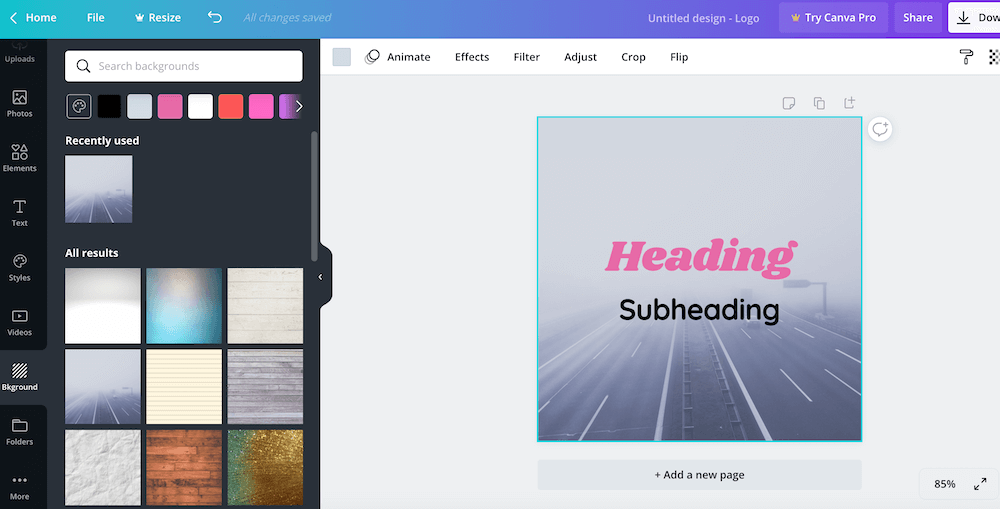
But maybe you want to go for a little more of a professional podcast logo right from the start (and if you’re not a designer, that can be tough to achieve on your own… I speak from personal experience!).
Let’s check out a few options you can choose from if you’d rather hire a designer to create your logo for you.
Where to Get the Best Podcast Logo Designed for You
If you’d rather forego a career in podcast logo design and want to use a designer or company to make a logo for you, there are a lot of affordable options – and pricier options – out there.
A design company we’ve used to make multiple design projects come to life in our business is 99 Designs.
All you have to do is submit your design brief, and then dozens of designers will share podcast logos for you to choose from. You can request edits or changes, and once you choose your favorite design, it’s yours to use on your website, as your podcast artwork, on your social media channels, and for any other branding purposes.
Because 99 Designs was a sponsor of our podcast, we have a special offer to share with you! If you sign up at 99Designs.com/fire you’ll receive a $99 Power Pack for FREE!
Podcast Logo Designs on a Budget
If you’re looking to keep the cost of your podcasting logo to a minimum for now, you can also check out Fiverr.
Fiverr is a great resource when you’re looking for freelance services for your business. Whether it’s your podcast art, formatting an ebook, or any other task you need help with, Fiverr has a freelancer who can help!
We’ve done several projects using Fiverr, and if you’re willing to invest the time to find the right person, then you’ll likely be satisfied with the outcome.
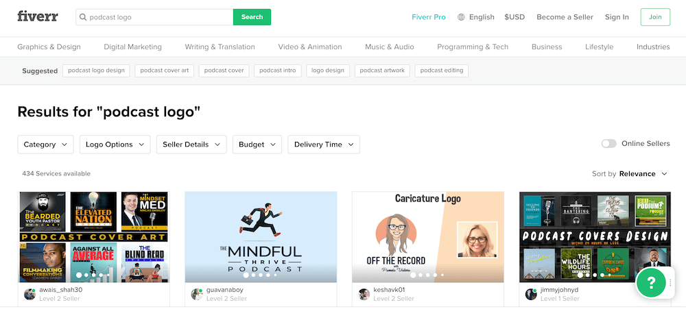
Here’s a quick look at the initial return when I typed “podcast logo” into Fiverr’s search.
But remember, when you go the route of hiring someone who might not necessarily have a huge design background, you should definitely be prepared to provide a lot of guidance. And of course, oftentimes you get what you pay for.
This is not to say you need to invest a lot of money on your cover art, but do consider the long-term benefits of having a great logo right from the start.
You’ll also want to ensure once the freelancer is finished with the design and delivering you final files that you have all the original design files (in case you need to make future changes), plus full rights to the design itself.
Podcast Logo Examples
Now that you have a solid idea of what your podcast artwork should include, and you have resources to help you regardless of whether you want to create your own podcast design or hire a designer, let’s look at some podcast logo examples!
Looking at examples is not only a great way to generate ideas and get some good design brainstorming going on, but it’s also an effective way to learn what you like and what you don’t like. And knowing what you don’t like can be incredibly helpful!
Having this knowledge when you go to create your own design – or when you’re directing whoever will be creating your design for you – will save hours and potentially a lot of money.
Eye-catching Podcast Logos
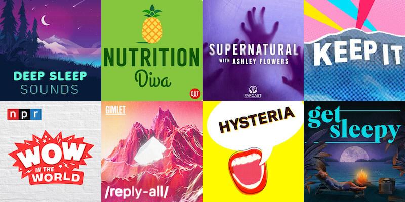
Scanning multiple categories in the Apple Podcasts directory, I grabbed several screenshots of the artwork I think is most eye-catching.
It grabs your attention with a graphic or color scheme and really draws you in.
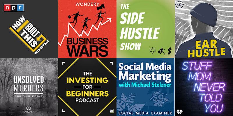
Clear Podcast Logos
These logos all have a way of clearly sharing what the podcast is about. You don’t have to see the logo and then wonder whether it’s the right show for you or not – you can make that decision immediately.
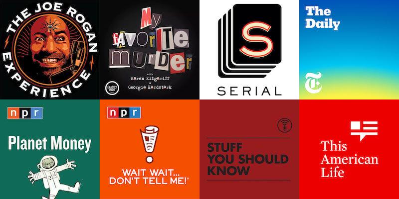
Top-Ranked Podcast Logos
Based on stats provided by Edison Research, which we’ve cited along with many other top podcasting statistics, here’s a visual look at the top-ranked podcasts.
Other Podcast Logo Considerations
Make sure when you’re considering how and where to to get the best logo for your podcast that you’re not compromising. Your podcast logo design is important, as it’s the first thing your potential listener will see as they consider whether your podcast is right for them.
One way to be confident you have the best podcast logo is to confirm it resonates with your ideal listener. Make sure it’s clear, that it stands out, and always use colors and fonts that are easy to consume.
You can do this by running a survey if you have an existing audience, or by simply posting it on social media and asking for feedback.
During the design process it’s also important to consider in what other ways you’ll use your podcast logo. For example, you’ll likely want to have a tab on your website for your podcast, and this might require that you have a vertical or horizontal version of your cover art.
Be sure you have options to use for social media, newsletters, and print materials. And again, don’t forget to ask for the source files for your podcast logo if you have someone else create it for you. While the design might originate as your podcasts logo, you never know what else you can use it for!
Happy designing!
