One step I see podcasters get hung up on when starting a podcast is their podcast artwork. Of course your podcast artwork is important; it’s a visual representation of what your podcast is all about.
If you imagine an individual opening iTunes or Apple Podcasts and searching a specific category or keyword to find a great new podcast to listen to, the visual aspects will certainly play a role in helping them choose.
Why your podcast artwork is important
Bottom line: terrible artwork will pretty quickly be associated with terrible content.
However, your podcast artwork shouldn’t be the thing holding you back from launching your podcast.
I say this for two reasons:
- Because your podcast artwork can be updated at any time; and
- Because everyone has an excuse as to why now “isn’t the right time” to launch.
On any given day you might come up with five or more reasons why you’re not ready to launch your podcast. But I can guarantee all five reasons are excuses – things you’re telling yourself in order to avoid the outcomes you’re making up in your mind.
That’s why I’m creating this post: to give you the 5 things your podcast artwork must include so you can check these 5 things off and move full speed ahead with launching your podcast!
Your podcast artwork checklist
When you’re able to break a task down into smaller steps, that task becomes much more manageable. And as you already know to be true about your podcasting journey, the number of tasks that build up when starting a podcast are many.
So just as I’m about to do with this podcast artwork checklist, I encourage you to replicate this for the other tasks that are on your list as your work towards your podcast launch.
If you’re looking for a little less intense route that will help you get to launch, you can check out The Podcast Journal: Idea to Launch in 50 Days.
The Podcast Journal is a physical Journal and it does what I’m about to do below for every task necessary to go from idea to launch with your podcast in 50 days. You can think of it like your personal guide so you don’t miss a single step along the way :)
5 Things your podcast artwork must include
1: A clear message
This really starts at the naming stage – your podcast name must be clear. So clear, in fact, that when your avatar or ideal listener hears it or sees it they immediately think “YES! This is for me!”
Your podcast artwork has to immediately be able to communicate this thought for your avatar. How can you clearly communicate in a small amount of space what it is your podcast is about?
2: Less is more
Overcrowding your podcast artwork is the absolute worst thing you can do.
While I get that you want to include sufficient information on your podcast artwork so that those who see it will know what your podcast is all about, well – see 1 above.
My best recommendation here is to use your title and some type of accompanying icon that makes sense. Everything else is optional. Your tagline, your name, your photograph – none of these things are necessary in order to create amazing podcast artwork.
3: Visual POP and uniqueness
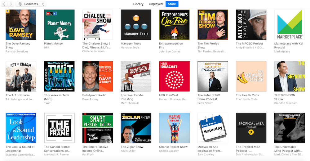
When you look in the iTunes Podcast Store, you’ll notice the podcast artwork icons are pretty small. This means your podcast artwork must stand out, otherwise it’ll easily get lost.
Make sure your artwork POPS and that it’s unique. The colors you use, the shadows, the icon you choose – be creative!
Take a look at the image below for an example – this is the What’s Hot section of the iTunes Podcast Store.
Which podcast artwork stands out to you? Which of them POP and are unique?

The same way some of the above podcast artwork stands out to you, there may also be ones you don’t like, that are hard to read, or that just don’t make a whole lot of sense.
This is helpful feedback, too, because when we know what we don’t want we bring ourselves that much closer to what we do want.
Jot down a few notes on the things you like and don’t like from the above podcast artwork examples. This will helpful when you begin to create your own.
4: Maximize space
Because of the small space you have available, you have to maximize it!
Don’t leave a bunch of blank, open space on your podcast cover art when you could be using it for a larger font or for an icon that helps visually represent your topic or brand.
5: Follow the Apple Podcasts (iTunes) artwork requirements
Last, but certainly not least, your podcast artwork must meet the Apple Podcasts (iTunes) requirements, otherwise your podcast feed will be denied on the Apple Podcasts platform.
Review the most up-to-date podcast artwork requirements published by Apple Podcasts before you get started (expand the heading Feed and image requirements).
What if I’m not creative?
If you’re like me and at times feel creatively challenged, go ahead and open up the iTunes Store and click on the Podcast tab.
Check out the overall top podcasts, in addition to drilling down into some of the specific categories listed.
Again, make notes of what artwork you’re drawn to, and why.
What elements of your favorite podcast artwork would you like to carry over into your own design?
What elements do you know you definitely don’t want to be a part of your podcast artwork?
Your podcast artwork resources
Once you have a good idea of what you want your podcast artwork to be, it’s time to take action!
If you want to design your own logo (DIY), then check out these programs:
- Canva.com
- PicMonkey.com
- Photoshop (if you know design)
If you would rather have someone else design your logo, here are a couple of great options:
- Podcast Design Studio (Fire Nation special!) (Sorry! This link was active when this episode was first published in 2019. This resource is no longer available.)
- DesignCrowd.com/fire (special savings await!)
- Fiverr.com (projects start at just $5)
With a clear set of steps written out, creating your podcast artwork will become a lot more attainable. Plus, you now have multiple resources for taking that next step and getting your podcast artwork created!
Ready to take your podcast from idea to launch in 50 days? Snag your step-by-step guide with daily exercises and prompts to help get you there: The Podcast Journal!
[…] And, whatever is it that you, just ensure that you are not overcrowding your artwork. […]