There are several reasons why your website’s homepage might need a makeover (probably way more than 5, actually).
A lot of you might already know that a makeover is in order, but you feel like because you’re not a copywriter, a designer or a web developer, you have no control over making the changes… That you need someone else to do the work because websites “aren’t your thing”.
Nice excuse – but I’m not buying it.
Unlike a real-life makeover where you pretty much HAVE to visit a salon, get a facial done by someone else, have a professional cut and color your hair and then trust your own personal shopper to pick out the clothes that will fit your body the best, your website’s homepage makeover can be done by you – and you alone.
5 Reasons why your website’s homepage needs a makeover
Ready to get to it? Here are 5 reasons why your website’s homepage needs a makeover, and how you can get the ball rolling all on your own:
1. You’re not communicating clearly
Writing online content is not something you learned in school. It doesn’t have to follow MLA guidelines, be in Times New Roman, size 12, or adhere to the strict margin and spacing rules. It also doesn’t have to include words that people have to look up in the dictionary to find out the meaning.
Your website copy – and this is especially important for your homepage – should be the easiest, clearest, most understandable copy out there. And who knows what your business is trying to communicate to your customers more clearly than YOU DO?
Pretend like you’re having an everyday conversation with one of your friends, and they’ve just asked you “What is your business all about?” Give them the low down, and then get it on your homepage! If someone visits your homepage, it shouldn’t take them more than 5 seconds to understand what type of business you’re running.
And I always like to throw this in there for good measure: less is more.
2. You don’t have a good opt-in offer
Your homepage was built to entice your audience to do something. You didn’t build a website “just because”, right?
Right.
Therefore, you should have a single, very obvious call to action on your homepage that aims at helping you reach a business goal. A great example is an opt-in offer: you create something your audience wants, and then give it to them in exchange for their email address.
What does this do? It not only weeds out those who don’t belong on your site in the first place, it also helps you build a strong base of potential customers who you can communicate with in what is probably the most effective way to reach your audience these days: via email.
You know what your audience wants. Create it for them and be rewarded!
3. Your visitors can’t identify your brand
If you already have a website up, you’ve likely (hopefully) already defined and/or created what your brand represents. This probably includes a logo (and therefore your color scheme), a tagline and the feelings you want people to have when they interact with your brand.
So, now it’s time to put it to good use!
Use your website’s homepage as an opportunity to get your audience to engage with your brand. Ensure you have a cohesive design that helps visitors identify your brand, gives them an indication of what your brand is all about (are you quirky, funny, serious, laid back, all business?), and social buttons so people can easily get in touch with you across all platforms.
These things will not only help your audience identify your brand, it will also help you to start building a strong brand. Give your audience something to remember you by so that you’ll have them coming back for more.
4. Your navigation is a mess
Imagine walking into a grocery store that doesn’t have signs hanging from the ceiling to direct you to the items you’re looking for…
Oh, and no floor staff to help guide you either.
How long would you spend aimlessly walking around before you got frustrated enough and just left?
Simple, easy to follow navigation is key. If people can’t find what they’re looking for when they land on your site, then they will not stay and play detective; they’ll leave and go someplace where they can find what they’re looking for.
Try using arrows or a content flow that guides your user down the path you want them to take.
5. You’re not showcasing the goods
Most oftentimes people land on your site via your homepage (unless they’ve clicked a direct link from someplace else to get at another page on your site). Therefore, you want to put your best goods front and center!
What is it that you want to showcase about your business?
In addition to the things we’ve already covered here, like a quick and dirty low down on what your business is all about, an irresistible opt-in offer, beautiful branding and a navigation that tells your visitor ease-of-use is top-of-mind, you’ll want to put your best foot forward.
This might be your blog if you’re a writer, or it might be a couple of great designs if you’re a designer or it might be a lineup of your show notes if you have a podcast. Whatever it is that makes you shine – and that you know your audience is interested in – should be right in front of their face.
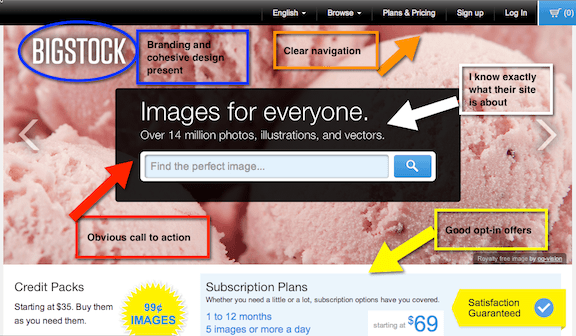
BigStock is a site that I really like a lot: it’s simple, clean, clear and it actually makes me want to purchase their stock images. Why? Because it’s so easy for me to do.
